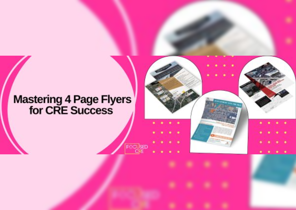
Commercial Real Estate Flyers that Engage
Flyers to promote your commercial real estate property is a tried-and-true strategy that has continued to prove efficient even in the digital transformation era. While they have evolved to accommodate for email marketing and digital download buttons, flyers have stayed consistent since their inception.
According to Google, the earliest form of the modern flyer was first seen during the Renaissance period in Italy (Though more crude forms existed centuries ago.) Flyers are cheaper, faster, and can be produced in massive quantities. It was a game-changer in terms of communicating information to a wide audience.
As commerce and information started making their way online, flyers consequently evolved to the digital space. Today, flyers aren’t relegated to being passed around on the street on a piece of paper but can be attached to emails, posted on social media, plastered on websites, etc. The effectiveness of these digital flyers will probably shoot up as the tech keeps on improving.
In our four years working on flyers for all types of properties across the country, we have rounded up some best practices that carry over from print to digital.
Layout
While highlighting your property may be the obvious focal point of your flyer, the overall design and layout you chose will determine if it is engaging or not. When it comes to choosing font styles, don’t use more than two typefaces in any flyer design. Using more than two typefaces on a single flyer will interrupt the flow of the text, shifting focus away from the actual message of the flyer.
Choose a color scheme for your flyer design based on the message. Use primary colors for a children’s design, bright neon colors to mimic a nightlife party scene, shades of green to represent health, or black and white to make a classy, bold statement. Using the colors in your logo, and/or adding some complimentary colors is an easy way to find a quick color palette.
Call to Action
A call-to-action (CTA) is one specific action you’d like your audience to perform after consuming the information on your flyer design. Do you want them to join the company newsletter, call a phone number, or visit a website?
The CTA of your flyer design should correlate with your current marketing strategy. For example, if your current marketing efforts are focused on increasing the downloads of a specific property’s OM, the CTA of your flyer might be to “Download Here.” Call to Action buttons are especially important when transferring from print to digital format. This encourages tracking and segmentation.
Keep it Concise
Your property has many things you want to highlight, but for a one pager like a flyer, it is important to keep it concise. For example, if you have a retail or industrial property, a Google Earth Aerial demonstrating the high traffic location may be a strategic option. If you do not have any high-quality photos of the location, pulling some from a Google Search is also a good idea.
We know that prioritizing this type of content is hard, that is why we summarized the importance of outsourcing your marketing here.
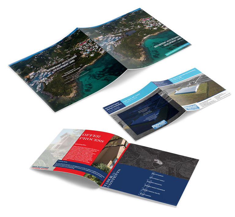
We have worked on more flyers than we can count. Clients not only come to us for flyer expertise, but once we finish an offering memorandum or BOV, we also turn those into one page flyers for email marketing purposes. View our full portfolio of Flyer Examples here.

